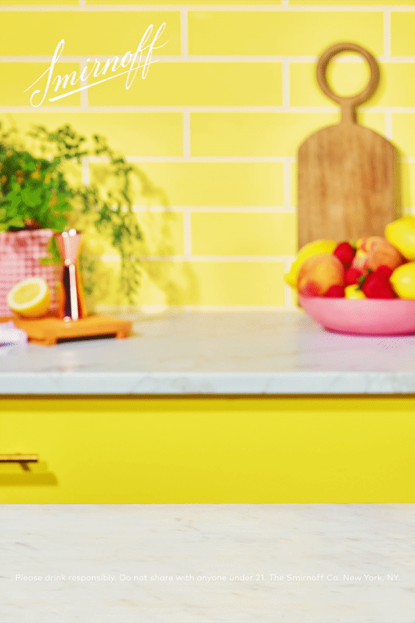
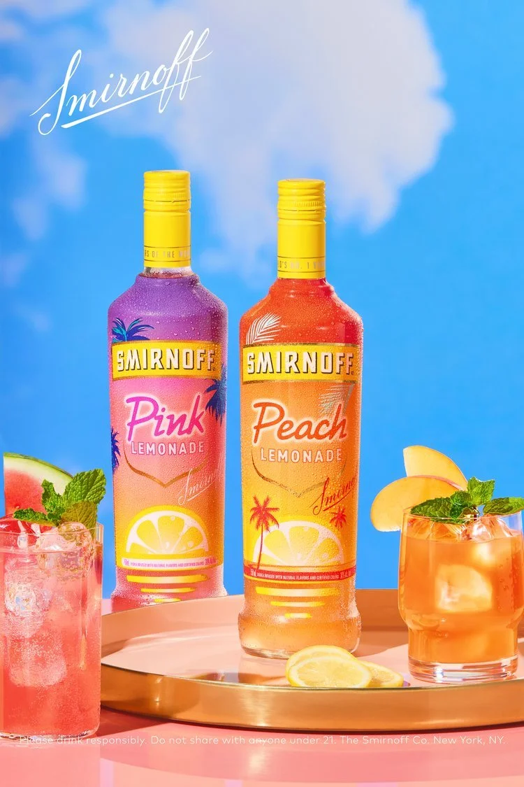
To refresh Smirnoff’s design for the launch of our “Vodka for the People” campaign, we leveraged the iconic brand elements and pushed them into a modern space that feels more attainable and less structured. Graphics are treated in a dynamic, modular way that is eye-catching and also reinforces brand recognition.
We’ve paired this with a photography style that feels intimate, inclusive, mid-tempo, and filled with moments of casual interaction to illustrate the various moments of connection and versatility Smirnoff No 21 Vodka embodies.
This guide showcases all brand elements available and provides guidance on usage for each and sample layouts needed to create a cohesive, consistent campaign that truly gives the people what they want.